這是一支用來宣告趨勢 2017 年度產品的概念性動畫,負責在記者會的開場,以及網路上面播映。
This is the concept animated video of Trend Micro’s new product in 2017, and was played in the beginning of the press conference as well as on the Internet.
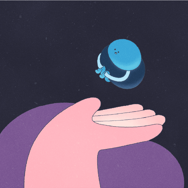
目標群眾偏向男性為導向,主色以藍色為主,設定是帶來穩定與安心的感覺。雖是資訊科技類的影片,但我們避免過於科技與專業感,反而採用「輕鬆活潑」的氣氛增加親切感。
The target gender of the video is tailored towards male audiences, with blue being the primary color of the video, which brings a sense of stability and comfort to the viewer. Although the video is based on an IT product, we designed the video to have a more casual and upbeat feeling instead of being too technological or professional, with the overall goal of making the video more friendly and intimate to the viewer.
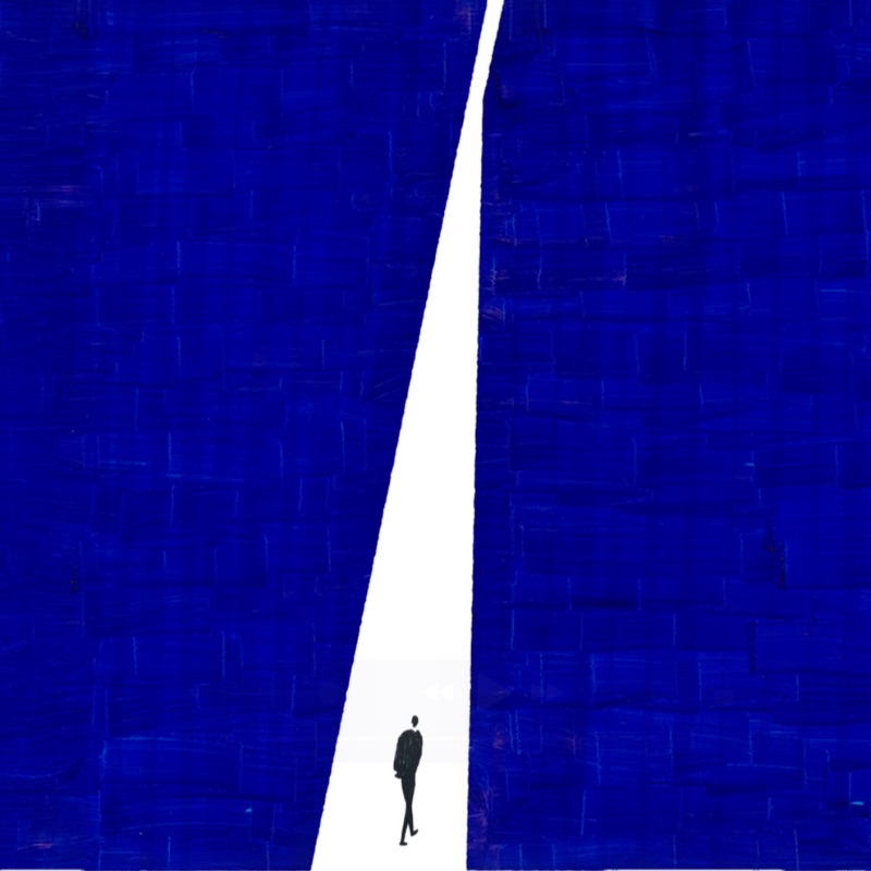
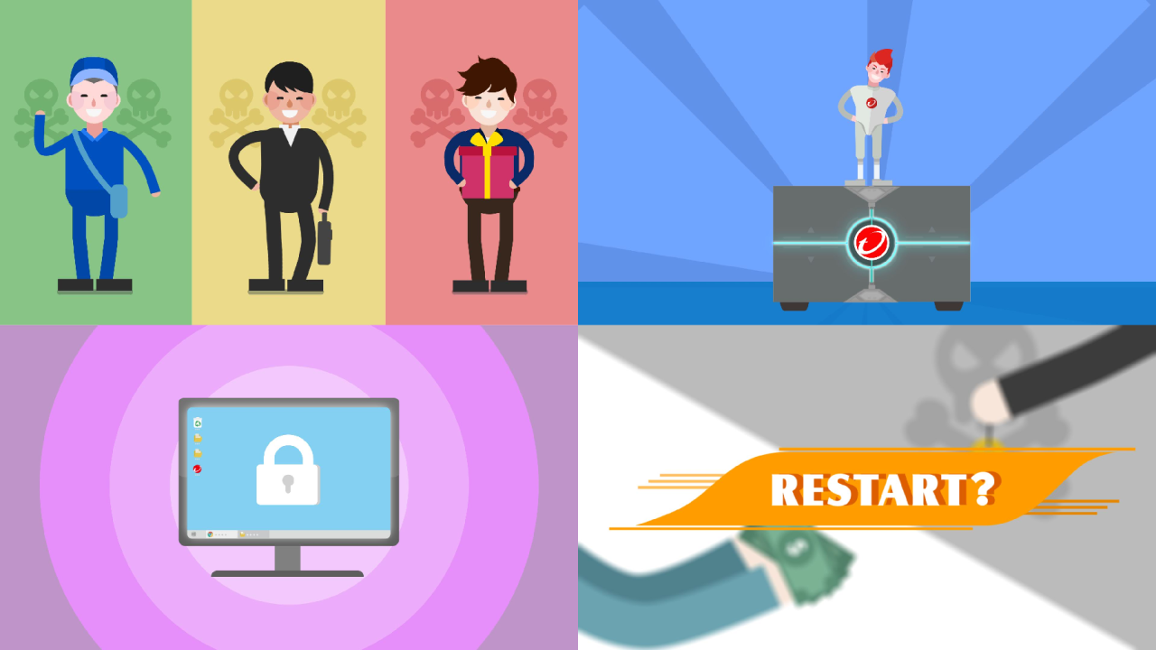
為避免一成不變,整體顏色方面我們依不同情節而有不同變化。
To prevent the video from being too stale, we utilized several different contrasting colors to reflect the changing moods during the flow of the video.
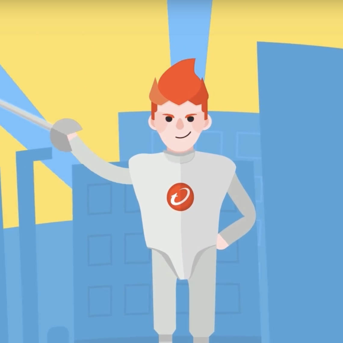
搭配趨勢科技新的「西洋劍手」的形象設定,我們也協助創造了一個動畫版的西洋劍手,供客戶未來延伸使用,後續客戶便 依此角色開發了一個簡單的網路小遊戲,配合粉絲團活動做宣傳。主角的顏色是以 LOGO 的紅色為主,利用背景的藍色做對比襯托,能 讓觀眾將注意力專注在紅色主角上面,把品牌印象烙印在腦海之中。
In accordance with Trend Micro’s new corporate image as a “fencer”, we also designed an animated fencer in the animation which provided our client with a mascot that they can use freely in future projects. The mascot has since been used in a simple web game as well as a marketing AD on client’s fan page. The color of the fencer is primarily red, inspired by Trend Micro’s logo, in contrast of the blue background, it successfully let the viewer focus on the fence in the video and deepen Trend Micro’s brand recognition in the viewers’ minds.

很開心有機會協助趨勢科技設計動畫。傳達產品的功能,不見得要直接了當地講述產品功能,建議找出最重要的核心訊息為何,影片中的每一秒、每個畫面,都是為了傳達這個訊息而存在著。
We are happy to have the opportunity to help Trend Micro design the video and convey the details of their product, not by directly summarizing all the functions but by finding the core values and goals of the product and communicate the values through every frame and every second of the video.