這是支專為「商務人士」觀眾群設計的動畫影片, 風格設定「專業」、「簡潔」,以 Tech Design 網站 的藍色為主,綠色為輔營造清爽簡單的感覺。
This video is design for “Business Audience”. It’s style is set to be “Professional” and “Clean”, and.by using Blue ss the primary color of Tech design, Green as a secondary color for the simple and fresh vibes.
我們藉由專案初期的需求訪談與分析,了解到這是一支屬於功能性的說明影片,目標群眾鎖定在歐美的創業家,目的是將 Tech Design 的嶄新平台與服務,簡化成觀眾明瞭易懂的畫面,清楚地說明給觀眾了解。
Through analyzing the interviews we have done at the start of the project, we understand that this video’s purpose is to introduce the service Tech Design provides. The target audience are entrepreneurs located in Europe and the United States. Our goal is to simplify Tech Design’s new platform and service to viewers via easy to understand animation.
而動畫呈現方式,也採用類似商務人士熟悉的簡報方式,致力於清楚明瞭,而非炫光奪目。
Therefore, the animation is done via presentation format that is familiar to business personnel without too much frazzle and dazzle.
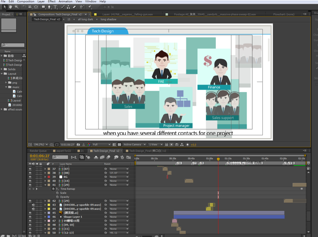
腳本/分鏡設計 Script / Storyboard

美術設定 Art Design

動畫製作 Animation Design
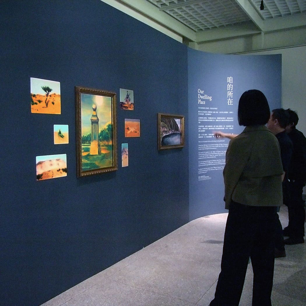
目標觀眾 ( Target Audience,簡稱 TA ) 是誰,將會很大程度地引領著動畫的視覺風格走向,比如做給「商務人士」觀看的動畫,和做給「大眾」看的動畫,便是截然不同的感覺,所以在了解動畫需求的最初期,最必要討論的問題就是「 TA 是誰?」,經過對於 TA 的分析,在設計動畫的同時便能增加 TA 會喜歡的元素、興趣、設定,將動畫所欲傳達的訊息,以 TA 能夠最舒服接受的方式傳遞給他們。
Each animation is guided by its target audience. Animation for “Business” will be different from animation for the mass. So it is important to understand who’s the target audience at the beginning of the discussion. Through analyzing the target audience, more elements can be added into the animation, resonating with the interests of the target audience so that the message is delivered to them clearly.